
At Outset PR, we built the syndication map – a system that visualizes how one article can multiply across crypto-native spaces, exposing the real distribution power behind crypto publications. Co-written with our senior media analyst Maximilian Fondé, this article picks up where our previous piece left off – unpacking syndication not as PR trivia, but as a data goldmine for crypto brands.
Now, we’re taking a step further. We’ve evolved manual tracking into a live analytical model that doesn’t just measure reach but also predicts secondary coverage and helps optimize every PR dollar.
How the idea started
The story of the syndication map goes back to the wild days of 2020-2022, when our founder Mike and content lead Yana were tracking those republications that pop up after a story lands on a crypto outlet. Back then, the process was painfully analog – think endless spreadsheets, tabs within tabs, and heroic amounts of screenshotting aggregator feeds. The concept was there, but the structure didn’t yet exist.
The real turning point came in late 2024, right in the middle of a hectic streak of organic placements. Max remembers how our media relations head Anastasia would request updated outlet lists almost weekly – each time triggering another marathon of manual checks. That’s when we shifted from counting to mapping. Instead of asking “How many reprints did we get?”, we started asking “Which outlets consistently spark secondary coverage, and how can we use that knowledge before the next campaign even launches?”
By early 2025, Max decided enough was enough and rebuilt the system from scratch. After months of hand-tracking, he and Mike sat down to reimagine the whole thing. The premise was simple but ambitious: if we can map how content echoes across other platforms, we can predict how it performs.
In January 2025, Max unveiled the first working prototype. What started as a set of unwieldy tables soon turned into a layered structure – one that revealed which outlets triggered republications, which sites picked them up, and how far a single story could really go.
That moment marked the birth of the syndication map: a standalone PR tool designed not just to measure campaigns after the fact, but to shape them from day one.
Decoding the syndication map
Basically, the syndication map isn’t a dashboard, but a living analytics system that mirrors how crypto media really works.
Structurally, it’s a graph: horizontal layers represent aggregators like CoinMarketCap or Binance Square, while vertical ones show media outlets that feed into them. Every connection reveals a probability – how likely a specific outlet is to trigger a pickup or reach a top aggregator feed.
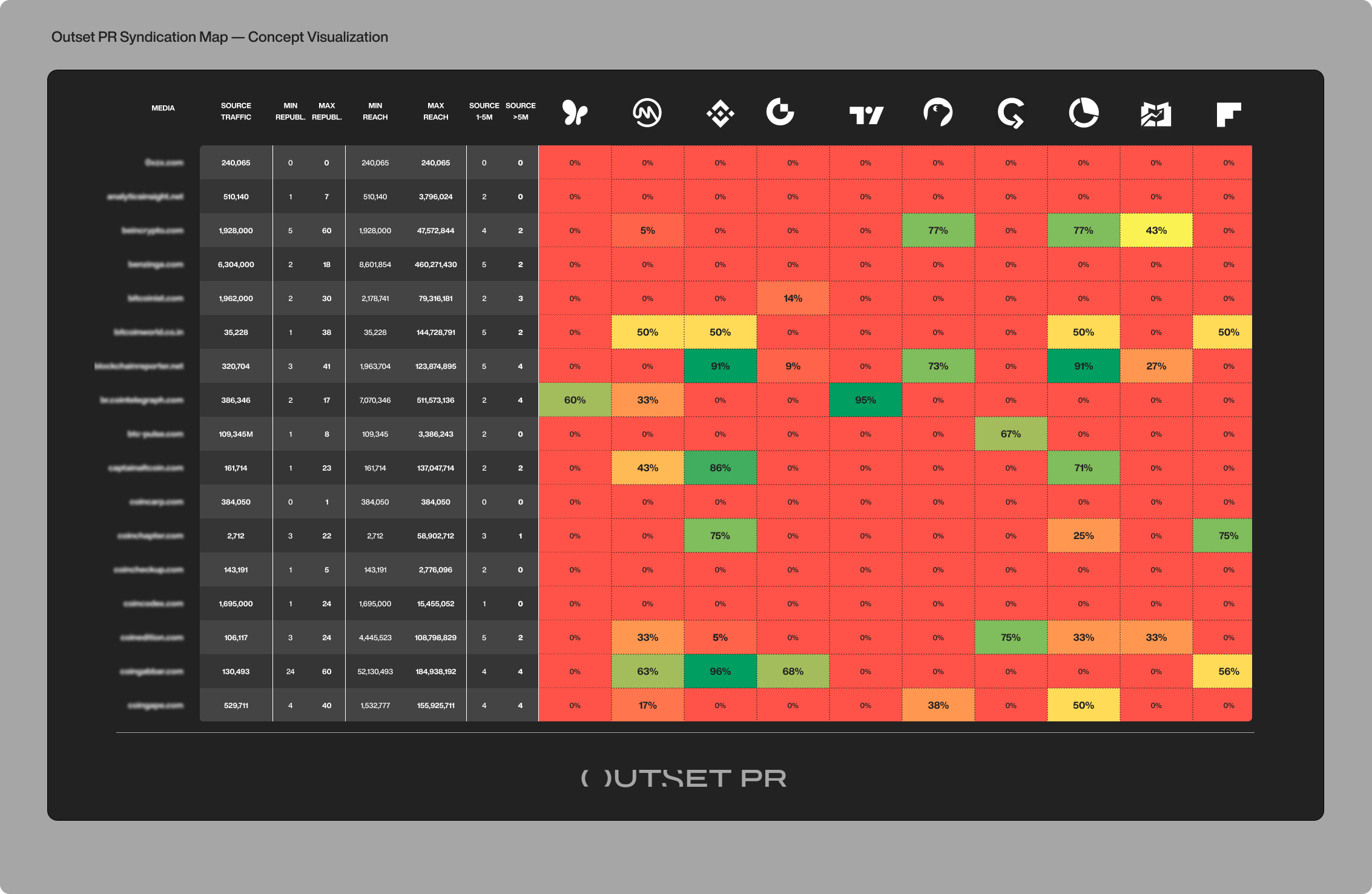
Each outlet has its own data card that later merges into a unified overview, the one where you can see monthly traffic of each outlet, the number of republications, maximum outreach and syndication potential. The map updates monthly and new syndications are added as soon as new campaigns go live.
Zoom out, and here’s what you’ll see
Once the syndication map started running, the patterns surfaced fast. Some outlets behave like megaphones – triggering a cascade of republications within hours. Others are dead ends, no matter how strong the story.
By tracing hundreds of articles and their “syndication trees,” we began to shape predictable distribution chains. A single post on a mid-tier outlet can ripple across aggregators and eventually show up on global platforms – but only if the outlet’s feeds are well-wired into the ecosystem.
The hierarchy became clear:
- Tier-1 outlets bring instant credibility and long-term SEO value – but not always much syndication momentum.
- Tier-2 media often punch above their weight in reach, driving aggregators and multilingual pickups that Tier-1s rarely trigger.
- Niche tier-3 sites sometimes steal the show as hidden champions: modest traffic, but high citation frequency and deep integration into syndication loops.
With every new dataset, the model gets sharper. The more stories we process, the easier it is to tell which crypto news sites are visibility engines – and which just look good on paper.
For clients, that’s a dose of welcome transparency. They can finally see what each publication really delivers, compare campaign performance in black and white, and build the right mix for their goals – whether that’s reach, traffic, or pure credibility.
Raising the bar (again): Where we go from here
The syndication map is still evolving – and fast. The next stage is all about scale and precision: more outlets, more aggregators, and richer data behind every connection. We’re now expanding the database to include audience estimates for each republication – how many readers actually see a secondary post, and where that traffic flows next.
On the visual side, the plan is to move from spreadsheets to something much more alive: interactive maps and 3D graphs that feel closer to a “media heatmap,” where every publication has its own color, size, and depth. We’ll include the ability to filter by aggregator, region, or media platform – and instantly trace the pathways of syndication like flight routes across the media sky.
As Max puts it:
“It’s our navigation map for the crypto media ecosystem – a place where you can see not just the surface, but the structure underneath.”
A new standard for measuring PR in crypto
The syndication map reflects how Outset PR approaches the industry: by seeing the mediascape not just broadly, but deeply – and turning that understanding into structure. It makes PR measurable, predictable, and most importantly, honest. What once depended on instinct and luck now runs on system and clarity.
As Max concludes:
“Without a doubt, it can become the new standard for measuring PR effectiveness in crypto. It’s ridiculously convenient: it saves hours of work and wraps all our hard-earned expertise in one neat package. Honestly, it’s become irreplaceable – not just for our team, but for the whole industry.”


